When I opened PeakD this morning, my eyes were drawn to the bright yellow icon near the top right of the screen. Then, completely blown away, I saw Discord chat integrated directly into HIVE.
OK, not exactly Discord. But Sting Chat fully integrated into HIVE is better for 97.3% * of Discord use cases. So I really don't understand why it isn't adopted more widely by HIVE community admins. I think Discord users might consider retaining it for the chit-chat, if they must. But use Sting Chat for important announcements and support.

On opening Sting Chat, my first thought was, "When did this happen?" So I scrolled up for relevant info in recent messages. Quickly realising that I had serendipitously arrived very early into this new addition to PeakD. Then I spotted an intriguing question from @szejq
Is it possible to disable or change the yellow color of the chat icon?
Personally, I like the yellow and black chat icon. But I could not resist the challenge from Poland.
Changing Sting Chat Icon
One thing I love doing is messing with people's carefully designed websites using my own CSS. But my specific challenge was if I could override the image source set by HTML using CSS.
First, if you haven't used it, you need to add the Amino Editor extension to your browser. Making sure to pin it. So you can click the extension button to get…

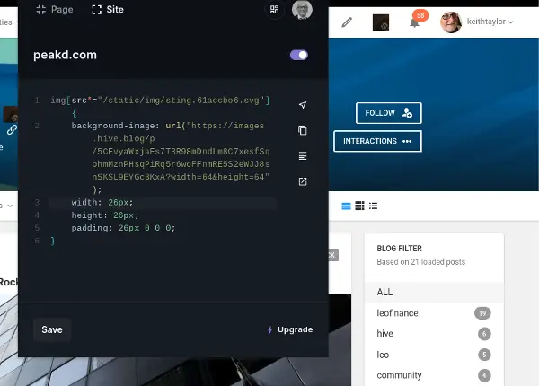
Next, select Site in the Amino Editor. Unless you want a different icon for certain pages only. Then paste the following code:
img[src*="/static/img/sting.61accbe6.svg"] {
    background-image: url("https://images.hive.blog/p/5CEvyaWxjaEs7T3R98mDndLm8C7xesfSqohmMznPHsqPiRq5r6woFFnmRE5S2eWJJ8snSKSL9EYGcBKxA?width=26&height=26");
    width: 26px;
    height: 26px;
    padding: 26px 0 0 0;
}
Finally, Save your code snippet, and make sure the snippet is switched on with the toggle button near the page/site URL. If you change your mind, simply toggle the snippet off.
I got the address I used for the background image by right-clicking @szejq's avatar. But you need to change the width and height parameters to 26. Unlike the default 64 from my screenshot (oops). Or just use any 26x26 image.
The last line of code hides the original icon by sliding it down, out of view. So, you could get a simple coloured box using:
img[src*="/static/img/sting.61accbe6.svg"] {
    background-color: rgb(157, 33, 44);
    padding: 26px 0 0 0;
}
In this example, I used rgb(157, 33, 44) to match the Sting Chat background colour.
My thanks to Alan Morel of SABE for How to Set img src using CSS.
Can Sting Chat Be Improved?
I'm not certain that changing the Sting Chat icon represents an improvement. But there are certainly improvements in the pipeline. According to Sting Chat now on PeakD. So I'm going to look at integrating it with my Web2 sites. In an attempt to attract more Hivans.
But now, let me switch off my Amino Editor snippet and get the nice icon back...
Wait a minute! That burgundy block is cool.
* Source: 97.3% is my guestimate with absolutely no research. By the way, though I doubt the value of actually making this icon change, Amino Editor is a useful tool for many situations. Such as implementing your own dark mode for sites that don't offer it.
Return from Improving Sting Chat? Maybe Not! to Keith Taylor's Web3 Blog

